
Teaching tips
Tips for teaching economics using data
Read a summary using the INOMICS AI tool
Real-world data in their varied forms are the authentic artifacts through which we observe economic phenomena. Such data can be used in economics courses as part of learning and assessment activities to help students construct economic meaning and develop important employment skills in organizing, interpreting and presenting quantitative data.
Using data visualization as a learning tool
One way of motivating students to engage with economic concepts is to begin by showing a visualization of the data, to stimulate students’ interest. Evidence suggests that these visualizations can increase student learning and engagement and deepen their understanding of economics, particularly at an introductory level.
An important aspect of the visualization is that there needs to be a striking feature to draw the student’s attention to an issue, concept, or theory, creating a narrative for students to investigate. A time series graph with spikes or trends in the series can be a useful way of drawing the eye and stimulating interest.
The visualization should prompt questions that start the learning process: what is going on? Why is this happening?
Data visualization is a powerful tool to raise awareness and interest in many economic concepts, topics and theories. It facilitates the application of economic analysis and therefore aids with the consideration of debates, controversies and alternative schools of thought around those issues. As an example, Figure 1 shows one important macroeconomic indicator: the rate of Consumer Prices Index including owner occupiers' housing costs (CPIH) inflation in the UK. The CPIH is the preferred inflation measure of the Office for National Statistics (ONS).
Figure 1: UK rate of CPIH inflation
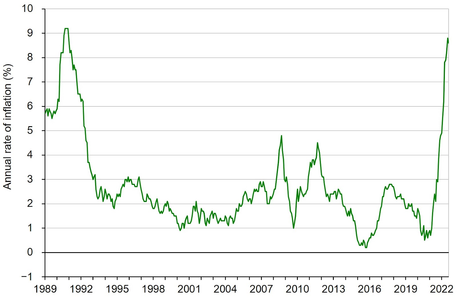
Note: CPIH is CPI plus owner-occupied housing costs and council tax.
Source: Based on time series data, ONS (series L55O)
In the graph above, student’s attention will probably be drawn to the sharp uptick in inflation from 2021. They should be suitably intrigued and quickly follow up with the question as to why this is happening.
Sometimes a chart that shows a contrast between two economic data series can be a powerful tool for illustrating changing relationships. For instance, Figure 2 shows the term structure of interest rates (yield curve) for the United States (US) at two different points in time.
Figure 2: US yield curves on 1/4/2021 and 1/4/2022
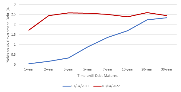
When addressing that first question in the learning process, students should see that at the start of April 2021 the relationship between yield and maturity was positive, while a year later it was very different. The visible difference in the graph can be used to prompt students to consider why the relationship changed.
In both cases above, answering why this relationship exists involves developing a conceptual understanding of the economic phenomena observed. For example, after students understand the reasons for the inflation shock shown in Figure 1 or the changing slope of the term structure in Figure 2, formal economic models can be introduced to develop students’ conceptual understanding. The intention is that when confronted with economic data in the future, students can intuitively apply the underlying economic theory.
The importance of data analysis
The analysis of data is one of three core competencies, alongside the application of findings and the effective communication of knowledge, that is identified by the Government Economic Service (GES) technical framework 2022. This document details the technical standards expected from UK government economists. Components of this core competency include the sourcing, organizing, interpreting and presentation of data, and the application of appropriate statistical and spreadsheet software.
Data-based projects that require students to source and analyze their own dataset will help to teach them key employment skills, and align with the practice of authentic assessment. There are important pedagogical benefits from encouraging students to identify and source their own unique evidence to demonstrate their understanding of a particular issue or economic concept.
Firstly, working with data can foster student confidence and help them to overcome any data-related anxieties that could be detrimental to their development as economists and interest in the subject. Secondly, data-based projects can enable students to feel that they are discovering things for themselves and constructing their knowledge and understanding as they do so. Consequently, they may develop a potentially unique perspective or research process to bring to discussions on a particular topic. Such active assessment has been found to improve engagement and academic performance.
To illustrate the latter, consider CPIH inflation further. We can decompose movements in the CPIH inflation by reference to 12 broad divisions based on the Classification of Individual Consumption According to Purpose (COICOP). Students could, for example, look at rates of inflation in particular divisions, such, as transport (Division 7) and housing, water and fuels (Division 4), alongside the overall rate of CPIH inflation. This is illustrated in Figure 3. Students could also analyze inflation rates of classes within the broad divisions. The key is that students are able to take ownership of the task and, through research and enquiry, deepen their understanding.
Figure 3: Rates of inflation by specific divisions
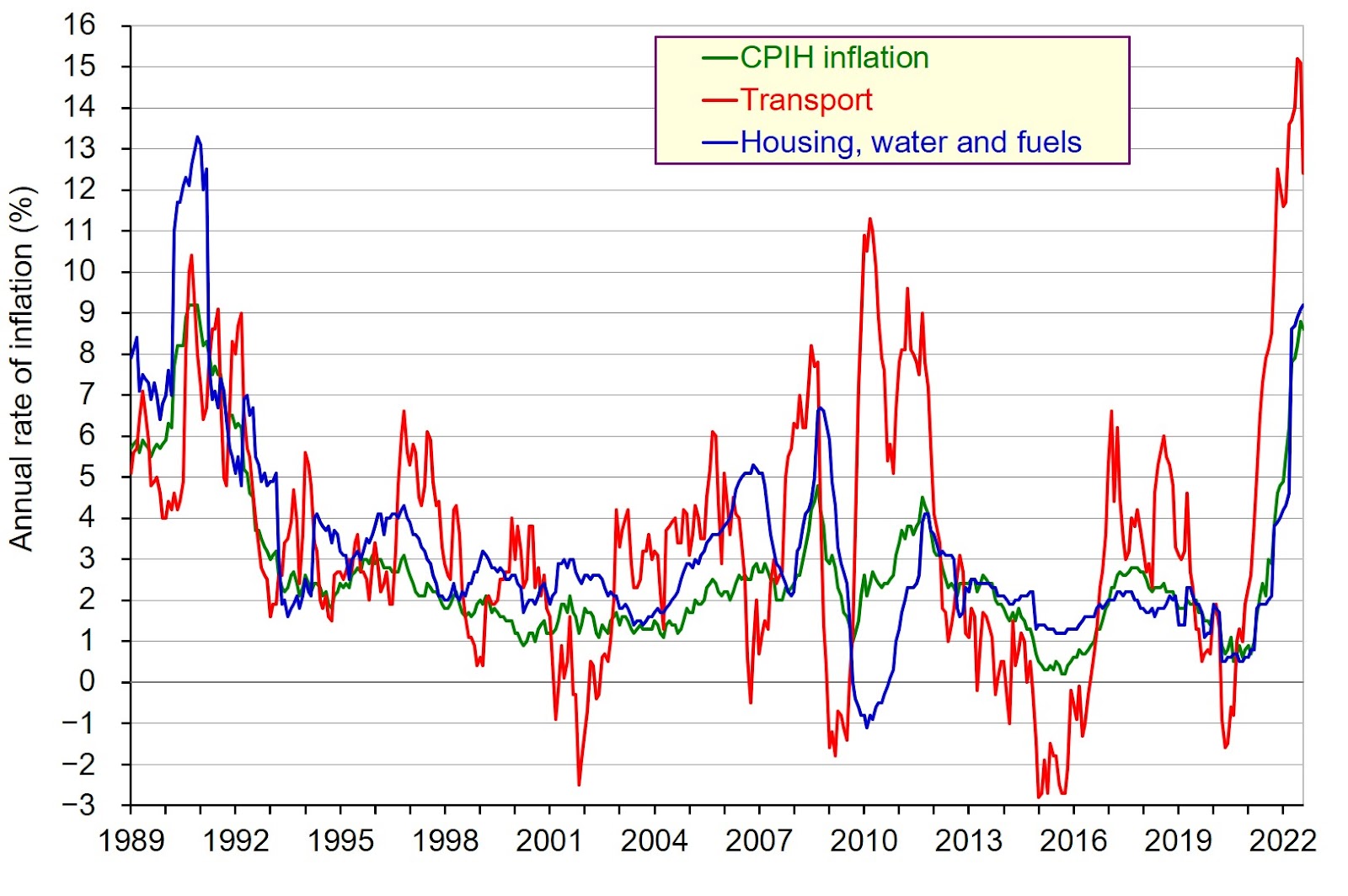
Notes: CPIH is CPI plus owner-occupied housing costs and council tax; core inflation is CPIH inflation excluding energy, food, alcoholic beverages and tobacco.
Source: Based on time series data, ONS (series L55O, L55S and L55V)
Conclusion
By incorporating data visualization and analysis in our teaching, we provide an authentic learning and assessment experience for students. This will help to further develop the competencies demanded by employers of economics graduates, such as the Government Economic Service in the UK. Further, it will stimulate student interest in the subject – principally students see the relevance of the discipline and its tools of analysis by working with data in an active way.
This article was produced in cooperation with the Economics Network, the largest and longest-established academic organisation devoted to improving the teaching and learning of economics in higher education. Learn more about the Economics Network here.
Header image picture credit: Pixabay.com
-
- Researcher / Analyst Job
- (Hybrid)
- Posted 2 weeks ago
Wissenschaftliche:r Mitarbeiter:in Metascience in Economics
At ZBW Leibniz Information Centre for Economics in 2911298, Allemagne and Kiel, Allemagne
-
- Assistant Professor / Lecturer Job
- Posted 2 weeks ago
Assistant Professor - Economics
At Salisbury University in Salisbury, États-Unis
-
- Senior Researcher / Group Leader Job
- (Hybrid)
- Posted 2 weeks ago
Senior Researcher Economics of Nature Valuation and Stewardship (80-100%)
At Wyss Academy for Nature at the University of Bern in Bern, Suisse
Currently trending in États-Unis


Related Items


Featured Announcements


Échéances à venir
- juil 26, 2026
- juil 26, 2026
- juil 29, 2026
- juil 31, 2026
- juil 31, 2026