Economics Terms A-Z
Indifference Curves
Read a summary or generate practice questions using the INOMICS AI tool
Indifference curves are a common sight in economics courses. They’re a foundational and helpful concept for economics students because they help economists easily depict people’s preferences. This can show the economist how someone is likely to spend their budget, what they’ll prioritize in order to maximize their overall happiness and well-being (or utility), and more.
So what are indifference curves exactly, how are they created, and how should they be interpreted?
Indifference curves are usually drawn for individuals. It is assumed that the individual is rational, has consistent preferences that don’t change, seeks to maximize utility, and that their utility increases with more consumption.
These assumptions are useful because they allow us to draw usable and meaningful indifference curves where each curve represents the same level of utility at every point on the curve. This is an important point that bears repeating: individuals achieve the same level of utility at any point along a single indifference curve.
As can be seen in Figure 1, each indifference curve is a line on a graph, where the axes represent goods or services that the consumer must choose between. Each line plots the combinations of products that would offer a specific level of utility for the individual. In this case, the indifference curves drawn are U and U’.
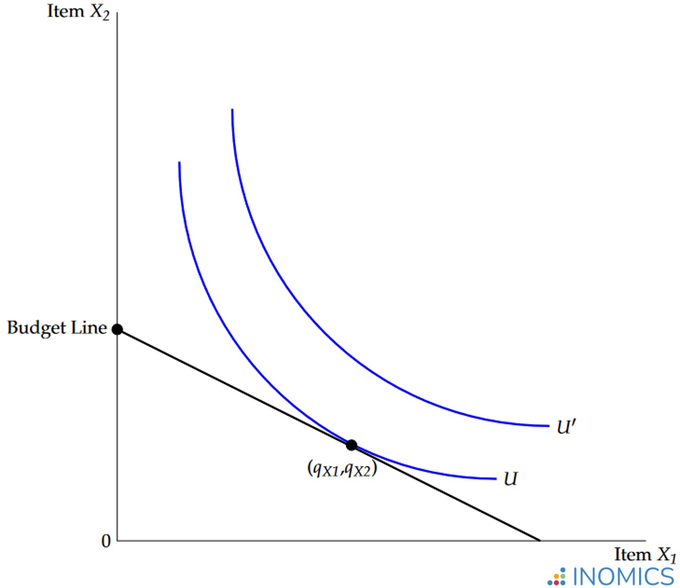
Figure 1: Standard indifference curves with budget constraint
Usually, the axes represent two different products or services the consumer can spend their budget on, often labeled Good A and Good B or X1 and X2. But sometimes, economists lump together “all products except X1” as one axis, and X1 as the other axis. This setup allows economists to study a consumer’s demand for X1 in relation to everything else the individual could spend their money on.
The points in the graph, and on each indifference curve, represent different mixes of products that the individual can consume. For example, point (qX1,qX2) is the point where the individual consumes qX1 units of good X1, and qX2 units of good X2. Economists call points like these “product bundles” or just “bundles”. Every point in the graph represents a combination of two goods that constitutes a bundle. As another example, the origin – the point (0,0) – is the product bundle where the individual consumes 0 units of good X1 and 0 units of good X2.
An important point to know about indifference curves is that curves higher and to the right are always better (more desirable; yield higher utility) than curves lower and to the left. This is because higher indifference curves contain larger, better bundles that the individual can consume (remember that we assume individuals get more utility from consuming more). Therefore, every point on indifference curve U’ is more preferred to any point on curve U, because any point on curve U’ yields more utility than any point on U.
In more mathematical terms: because the axes are increasing in X, and because utility increases as the individual consumes more (or, as X increases), indifference curves further from the origin of the graph represent higher levels of utility.
Some indifference curves are more preferable than others. But are some bundles on a given curve better than any other bundles on that curve? No – recall that the individual achieves the same level of utility for the various bundles along a single indifference curve. This is where indifference curves get their name from; because the individual’s utility is the same at every point along the curve, they are indifferent between consuming any combination of X1 and X2 that places them on the same curve.
For example, consider someone – Paula – who’s deciding between bundles of apples and oranges, and values them equally. Paula would equally enjoy eating 4 apples and 2 oranges as eating 2 apples and 4 oranges, so both of these points would be on the same indifference curve – perhaps like U. But, she would strictly prefer eating 6 apples and 4 oranges to either of those earlier options, so this point is on a new, higher indifference curve – like U’.
Finally, included in the graph is a straight, linear line. This represents the consumer’s budget. People can only consume what they can afford; this is represented by the budget line. As noted before, a person will choose the highest indifference curve they can reach given their budget. For the indifference curve to be affordable, it must touch the budget line at one point at least.
This means that the individual represented by our graph will choose the optimal consumption bundle (qX1,qX2), resulting in utility U. To get to this point, the person will choose to buy qX1 units of X1 and qX2 units of X2. On the indifference curve IC’ the individual would obtain even higher utility U’, but unfortunately this indifference curve is not attainable given the individual’s current budget M; it does not touch the budget line anywhere.
Good to Know
This still leaves the question of how indifference curves are made. How do economists draw one in real life?
Indifference curves are generated from a utility function. These are mathematical formulae that represent the preferences of a single individual. To make an indifference curve for a consumer, an economist sets the consumer’s utility function equal to a constant, and plots every point in the function equal to that constant. This maps out a curve like U’.
Of course, it’s difficult to know people’s utility functions in real life. The best method for discovering them is to observe the ways that people spend their money and their time. This is partly why marketing and market research are so important for many businesses. If companies can learn people’s preferences (or influence them), they can attract more customers by designing products they enjoy the most.
Further Reading
Indifference curves are a foundational concept, particularly in microeconomics, partly because they can actually be used to create demand curves!
To see how, consider again the graph above. If X1 represents oranges, and X2 represents every other good in the economy, the indifference curves represent a single consumer’s preferences for oranges compared to everything else they could buy. In other words, this is the consumer’s demand for oranges!
So, to calculate a demand curve for a good or service, an economist can combine every individual’s indifference curves for good X1. The resulting curve incorporates everyone’s preferences, and so tells the economist how much of X1 will be demanded compared to every other good in the economy.
Of course, this process can be more difficult than it sounds. To learn more about the relationship between indifference curves and the demand curve, check out Chapter 6.4 of Principles of Microeconomics by the University of Victoria.
-
- Postdoc Job
- Posted 2 weeks ago
Postdoc (m/f/x)
in Trier, Germany
-
- Researcher / Analyst Job
- (Hybrid)
- Posted 1 week ago
Wissenschaftliche:r Mitarbeiter:in Metascience in Economics
At ZBW Leibniz Information Centre for Economics in 2911298, Germany and Kiel, Germany
-
- PhD Candidate Job
- (Hybrid)
- Posted 2 days ago
Mehrere Doctoral Researcher (m/w/d) Für das Team "Forschung für die Finanzaufsicht"
At Deutsche Bundesbank in Frankfurt am Main, Germany
Currently trending in United States
Related Items
-
- Conference, Event
CALL FOR PAPERS 4th Ariel Conference on the Political Economy of Public Policy Ariel University, September 6–7, 2026
Between 6 Sep and 7 Sep -

Call for applications - PhD Program at the University of Basel Graduate School of Business and Economics
-

Associate professorship(s) in the fields of accounting and finance at Department of Business Development and Technology
Featured Announcements


Upcoming Deadlines
- Jul 21, 2026
- Jul 26, 2026
- Jul 26, 2026
- Jul 29, 2026
- Jul 31, 2026