Economics Terms A-Z
Gini Coefficient
Read a summary or generate practice questions using the INOMICS AI tool
The Gini coefficient is a statistical measure of inequality that describes how equal (or unequal) wealth is distributed among the population of a specified area (usually a country). It takes a value between 0 and 1, and a higher Gini coefficient is associated with higher levels of inequality. It can also be referred to as the Gini index or the Gini ratio.
The coefficient takes into account which percentage of total income (or wealth) in a country is owned by what share of the country’s population. A value of zero means that income is distributed equally across all members in a society. This would be the case if everyone had exactly the same income.
Conversely, a Gini coefficient equal to 1 means that the nation’s income is concentrated in the hands of very few people. For example, a country with 100 people where one person possesses everything and all others had no income would have a Gini coefficient equal to 1.
The Gini coefficient can be represented graphically by Lorenz curves as seen in the figure below. On the x-axis we have proportions of people ordered by their income from poorest to richest. On the y-axis, we see the cumulative share of the total income in the country. The red line corresponds to a Gini coefficient of 0, because income is distributed equally - for every 1% increase in population, there is a 1% increase in the total share of wealth. In other words, the "poorest" 10% of the population have the same income as the "richest" 10% meaning there is no poorest or richest 10% at all since everyone has the same wealth. In the figure below this corresponds to the red line labeled “perfect equality line”.
A Gini coefficient of 1 would mean that the richest person (or say the richest 1%) in the country owns everything, while the remaining 99% have no income. A Gini coefficient of 0 or 1 are clearly two very extreme scenarios. For most countries the coefficient is somewhere between 0 and 1. This more moderate scenario can be represented by a curve like the one depicted by the blue line in the figure below.
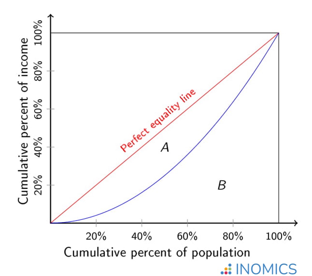
Figure: Lorenz curve for a Gini coefficient of 0 (red line) and a Gini coefficient between 0 and 1 (blue line)
The Gini coefficient corresponding to the blue curve in our figure above can be calculated as follows: Gini Index = A / (A+B). The area A is the area between the perfect equality line and the curve, while area B is the area between the curve and the axes. The greater area B is relative to area A, the lower the Gini coefficient and hence, the lower the income inequality in the country.
Now we know what the Gini coefficient measures and how to calculate it. But what’s more interesting is to compare Gini coefficients across countries and time. We can use the Gini coefficient in this way to compare inequality in different countries or regions, study how the distribution of income and wealth evolve over time, or analyze the impact of certain policies (e.g. the effect of a change in the income tax) on the distribution of incomes.
Although economics often focuses on comparing allocations of resources in terms of Pareto efficiency, the distribution of income and wealth among the population (which the Gini coefficient can help to measure) is also of great importance for policy makers. Countries with an extremely unequal distribution of income or wealth may be more vulnerable to social unrest and political instability (see also Inequality), and concerns for fairness and justice influence our opinion on different political parties and policies.
In the table below we see the Gini coefficient for five different countries in two years – in 2000 and 2016.
| Gini coefficients for various countries | 2000 | 2016 |
| Germany | 0.29 | 0.32 |
| United States | 0.40 | 0.41 |
| Mexico | 0.53 | 0.46 |
| Italy | 0.35 | 0.35 |
| Norway | 0.27 | 0.29 |
Each of the chosen countries has a Gini coefficient somewhere between 0.27 and 0.53 for the selected years. A Gini coefficient of 0.53 is considered high and implies that income is distributed rather unequally, as is the case in Mexico. The Gini coefficient of around 0.28 for Norway implies that income is distributed more equally in this country (but of course not perfectly egalitarian). In three of the five countries (Germany, US and Norway), the Gini coefficient increased between 2000 and 2016, while it decreased in Mexico, indicating that wealth inequality increased during this time.
The data used in this table was taken from the World Bank.
Further Reading
Among the most famous economists studying inequality are Thomas Piketty and Emmanuel Saez. In their paper “The evolution of top Incomes: A historical and international perspective” (published 2006, in the American Economic Review), they present findings on the changing levels of income and wealth in a variety of countries during the last century.
One of the main challenges in comparing income inequality across countries is the lack of homogeneity in the data and the availability (or lack thereof) of long-run databases. One of Piketty and Saez’s main findings is that during the 20th century the shares of income earned by the richest people in the society decreased decisively during wartimes and the Great Depression meaning that inequality decreased during these times.
Good to know
While the Gini-coefficient is a useful and important measure of inequality, it is not the only one. To get a more accurate picture of (in)equality, you might want to look at other measures of inequality as well. Other commonly used measures are the Theil index, the Hoover index, and ratios of percentiles or shares of income (comparing the mean income to the median income, etc.).
-
- Professor Job
- Posted 1 week ago
Professor, Economics
At Tyler Junior College in Tyler, United States
-
- Professor Job
- Posted 1 week ago
Professorship in Applied Microeconomics (Open Rank)
At Department of Economics, University of Fribourg (Switzerland) in Fribourg, Switzerland
-
- Workshop
- Posted 1 week ago
3rd International Workshop on Economic Complexity and Macroeconomic Dynamics
Between 7 Oct and 8 Oct in Castelló de la Plana, Spain
Currently trending in United States


Related Items


Featured Announcements


Upcoming Deadlines
- Jul 10, 2026
- Jul 10, 2026
- Jul 15, 2026
- Jul 21, 2026
- Jul 26, 2026